Case study

Topology

“Every time we send the annual reports Lovehate creates for us out to our funding bodies, they always say ‘Wow!’.”

CLIENT Topology INDUSTRY Music + Arts / Musical Education / Community Education SERVICES Branding
Graphic Design
Printing
PROJECT Annual Reports

The client / the challenge

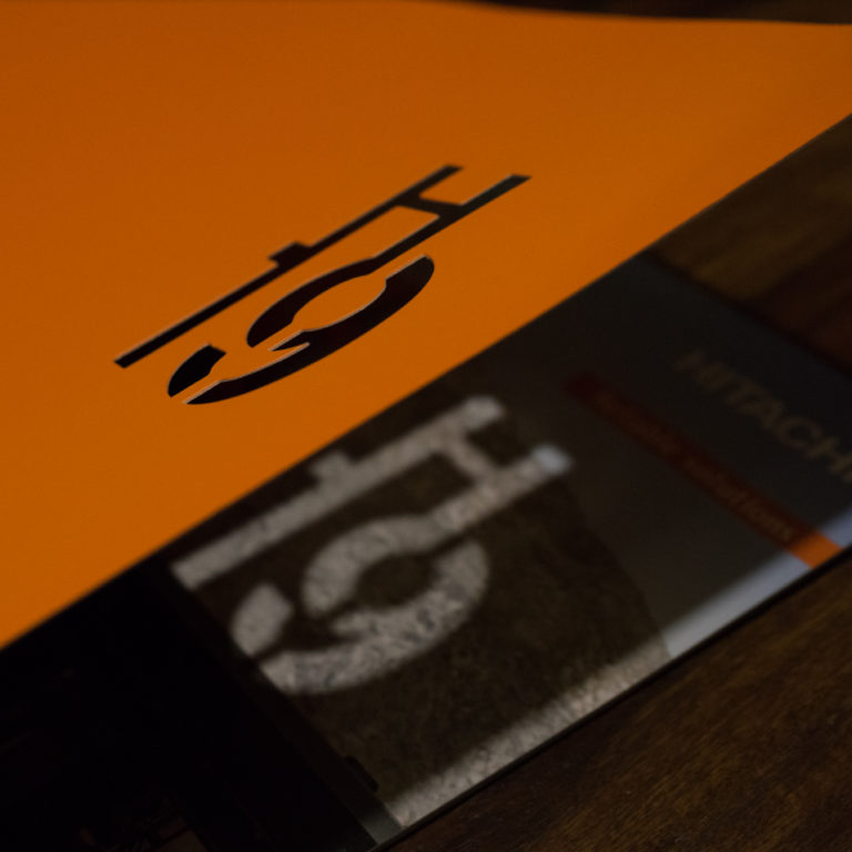
Topology are an exquisitely talented, boundary-pushing chamber quintet committed to modern musical composition. We’ve designed their album artwork for over a decade for multiple albums and worked with them on many other projects from signage to tote bags, programmes to posters and even their attention-getting, laser-cut business cards.

Recently, Topology expanded into offering musical education and community arts programmes. With this expansion came a greater need to apply for funding along with increased reporting requirements. With our long-standing, close working relationship with Topology, they naturally turned to us to help them with their annual reports.

Our strategic solution

We recognised that even a document like an annual report that can be considered dull or dry doesn’t have to be. Our strategy was to use the design and content for these reports as opportunities for this incredibly distinctive and creative brand to:

  • appeal to and communicate with potential funders and clients
  • express their unique values and brand personality
  • help share their achievements
  • tell the story of who Topology are and what they’ve been up to all year, and, of course,
  • fulfil the necessary reporting requirements.
CLIENT Topology INDUSTRY Music + Arts / Musical Education / Community Education SERVICES Branding
Graphic Design
Printing
PROJECT Annual Reports

We set out to create annual reports for Topology that aren’t just functional, but truly gorgeous to look at and read …

to help this unique brand to stand out, be heard and grow.

Each year, we use the Topology annual report design to capture and communicate what this talented group have been up to all year.

Our challenge is to always go beyond the corporate requirements and structure of an annual report to create a document that is compelling and exciting to read and that embodies the brave, creative spirit that’s at the heart of the Topology brand.

From the first edition, we defined a unifying style and layout for the Topology annual reports that forms the backbone of each year’s design.

In this way, each report remains recognisably “Topology” and looking like they belong together as a set, even though we mix up the design expression, colour, photography and more each year.


Via bold photography, engagingly written content and a mix of stats and stories,

each edition, we help Topology summarise what they’ve been up to that year, documenting their achievements, programs, performances and more,


And we even make the financials look good!


The annual reports look amazing and they make us look amazing.

Lovehate Design+Brand always gives us something we can be proud of to send around. Every time we show our annual reports to people they comment on how good they look.

Christa Powell Creative Director, Topology

We’ve been collaborating with these happy clients on their annual reports – and many other creative projects – for years now ….

The attention to detail that Lovehate Design+Brand pays to us and the fact that they take the time to understand the ethos of the company really shows through in the design.

If you’re on the fence about working with them … why are you on the fence? Just do it! You won't regret it.

Christa Powell Creative Director, Topology

Ready to grow your brand?

TALK TO US